Sunday, 19 October 2014

DecoArt Media Misters- Canvas

 DecoArt Media Misters- Canvas
This is a Fantastic new product very unique as it's an acrylic mister, this opens up a whole new world of possibility's

You have a better coverage and due to the DecoArt pigments very intense colour
Which is more pliable it doesn't absorb immediately into the media, you can mist, spritz and splatter and then move the paint around if you want to this is what I did on this Canvas
See Andy Skinner DecoArts Creative Director demonstrate them here

 I started by layering DecoArt Media Modelling paste through a variety of stencils

 As I applied to a black base, I then covered with white Gesso

 I then started spraying the colours lightly as this was the first time I had used them and I was amazed at the strength of colours you can get a fine spray effect or a splatter


 I started playing with applying them in different ways and dabbing and texturing how I wanted the paint applied


Once I was happy with the background I applied a layer of Ultra Matt varnish as I wanted a matt finish and to ensure that the next step wasn't going to cause the colour to shift, but due to the acrylic nature once dry you have a layer that is pretty permanent anyway


Than spritzed with the black through a CRW stencil allowed to dry and then off set the same stencil and applied another layer of modelling paste
Once dry. I sprayed with the Misters quite closely and smudged the colours again until I achieved a colour balance that I was happy with


I love all of the fab effects you can get with them from a very fine spray effect, splatters to Dappled effects
I used Black, Purple, Yellow Green, Magenta,Turquoise and Orange
You can find more infomation the product here

Friday, 17 October 2014

A Vintage Journey Challenge- Halloween - To Die For

Fantastic Spooky Challenge at A Vintage Journey, you can make any project using at least one Die and with a Tim Holtz Vintage theme

Halloween - To Die For
I love Halloween so couldn't wait to get started, my inspiration came from the amazing Configurations box that featured in the launch of the Laboratories Range 
I decided to create a secret book of Potions & Poisons 

I wanted to make it look really vintage, aged and distressed, I started adhering embossed and torn card stock in lots of layers to resemble torn pages and applied corrugated card to the cover and sides to look like pages


I then used the new Distress Spray Stains, using a combination Black Soot, Walnut Stain, Dusty Concorde, Rusty Hinge, Iced Spruce and Barn Door

I applied Modelling paste to the spine of the secret draw and textured
Once dry I used the Distress Spray Stains and dry brushed with Black acrylic

  I dry brushed with Gesso especially on the corrugated card board to highlight the pages

The back of the box was covered in embossed card and coloured as the spine


 The inside of the secret drawer was painted with DecoArt Carbon Black then lined with tissue paper and coloured with the Distress Spray stains

 I also made a shelf from mount board and painted black I applied lots of Gesso to this and the base to look like a build-up of chemicals
This was painted with DecoArt Acrylic Burnt Umber Quinacridone Gold, True Ochre and Lemonade

The bottles are Tim Holtz idea-ology Corked Vials, the main one is a Tequila miniature still full!,
The labels were stamped from Tim’s Poison stamp set and some I created as its difficult finding labels for Griffin Eggshells, Dream Sand and Angel Hair!
These were distressed with Old Paper, Walnut Stain and Black Soot around the edges and covered with DecoArt One Step Crackle and decoarated with coloured string and gauze to decorate

I filled with a variety of contents, embossing powders mica flakes and coloured water

The top was decorated with Tims Decorative Stripe Die Vintage Lace


The spider and skull and cross bones are from Tim’s Idea-ology Halloween Adornments these were coloured with Alcohol Inks, Pitch Black, Espresso, Oregano and Sunset Orange

On the cover I highlighted the embossed cobweb with DecoArt Metallic Lustre Black Shimmer & Silver Spark and painting the Tim Holtz decorative strip die Cobweb, and highlighting in the same way

The skull from the Tim’s Apothecary stamp set was stamped onto card, then coloured with Distress Inks Old Paper, Rusty Hinge, Walnut Stain and Black Soot around the edges and through the Tim Holtz layering stencil Shatter and splattered with paint

I hope you have enjoyed my Project, please pop back to A Vintage Journey to see all of the amazing Design Team creations and we look forward to seeing your project

Jools : )

Thursday, 16 October 2014

Stampotique Black, Purple & Pink

Glimmering Hope at night

I love these colours so dramatic that work as rich tones or lighter more sparkly ones

I started painting watercolour paper DecoArt Carbon black for the background
Then added white to get a very dark grey and then stamped with Meadow stamp randomly, then added a little more white and stamped again more in the foreground and lighter still for a final time

Then mixed a pale pink using DecoArt Titanium White and Vivid Violet and applied with the end of a paint brush for the flowers dots and with Lavender too

Then over stamped stalks in the fairground in Dazzling Metallics Shimmering Silver

Glimmering hope was stamped onto a piece of card covered in Silver metallic paint and coloured with Promarkers

The small moon was stamped onto the background with a grey, and then stamped again onto metallic card and coloured with Promarkers and just the middle cut out for a silvery pink moon

Friday, 10 October 2014

Stampotique Book Text


I love using old newspapers but I cant bear to tear up a book, so keeping it Stampotique I used the French Script as my background

I started by stamping Stampotique Spiral Velvet Chair, then stamping Puss Puss and masking off the background to stamp Daniels Hearts on the chair and then masked the chair and stamped the text
I then coloured with watercolours and Distress Inks
Take a seat and read your favourite book!

Tuesday, 7 October 2014

DecoArt Mixed Media Project- Theatre of Keys

An altered jewellery box that now houses a cast of dancing keys 

You can see my latest project on the new Mixed Media Blog, please click here to see the step by step tutorial

You will find lots of fabulous projects, product information and tutorials on the new blog 
You can also sign up for the Mixed Media Newsletter on the blog or subscribe here using the register box on the sidebar top right or click here

I hope you enjoy my project
Thank you Jools : )


Friday, 3 October 2014

A Vintage Journey’s Heavy Metal Challenge

Heavy Metal!

Fantastic new challenge at A Vintage Journey a great opportunity to use the fabulous ideology from Tim Holtz or his metallic techniques on your project


Now my go to on metal challenges is always Steampunk, So I decided to challenge myself to not use gears and cogs!
I don't make cards very often either and I keep seeing all these fabulous accordion flip cards and after some research settled on the Karen Burniston oval one

I have always admired the Riveted Patchwork effect which Tim used on his Heart and Soul Project and it appears in A Compendium of Curiosities Volume 2 Using
Metal Foil tape and Alcohol Inks, this was a great opportunity to use the technique with embossed foil


I cut the three section on a heavy weight card and then embossed the Ranger - Inkssentials Metal Foil Tape Sheets with Tim Holtz Regal Texture Fades
Then cut them the same shape peeled of the back and applied to the card
On hindsight it would have been better to have applied to the card first!
A point to remember that the embossing will only stay on the areas that are open in the die, but where the die is solid it compresses the embossing slightly but it does creates interesting textures
I embellished the outer two panels with Tim Holtz Key holes and screw top brads


I then started applying Adirondack Alcohol Inks Pitch Black, Espresso, Sunset Orange Pool, Stream and Butterscotch
Dripping them neat onto the foil and moving them around with the felt applicator, I love how it flows into the recesses and how if you have applied too much dark colour if you drip a lighter colour it will disperse

I used the turquoise and gold tones in the centre with the darker browns and black with a bit of orange towards the edge


I cut out a further oval in the central panel and applied one of Tim's ornate plate embellishments
I attached a small Tim Holtz heart charm on a chain behind this and applied metal corner embellishments with Glossy accents


Once dry I assembled the card as per the instructions, I hope you have enjoyed my project
Please pop back to A Vintage Journey to see all of the Design Team Projects and more details on the Challenge
Jools : )

Thursday, 2 October 2014

Stampotique Masculine

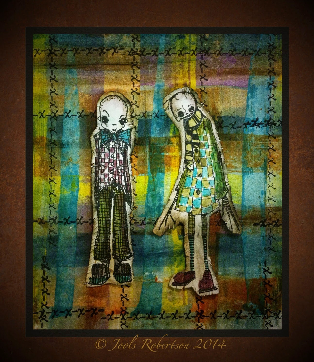
A Passion for Fashion

The boys love of Tartan hadn't quite got to wearing kilts!

The tartan effect background was created by placing blobs of paint on card and dragging across with a metal ruler, then turning 90 degrees and repeating I used the following DecoArt acrylics Quin Gold, Primary Yellow, Dark Chocolate, Desert Turquoise, Blueberry and Prussian Blue Then stamping with Stampotique Kisses

Stampotique Bow Tie and Dweeze

Were coloured using Distress inks as watercolours, Black Soot, Walnut  Stain, Scattered Straw, Forest Moss, peacock Feathers and Seedless Preserve